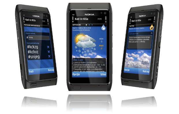
It seems you can’t turn anywhere today without some mobile app hitting you over the head. As it became so common and used everyday, it’s definitely time to continue a well known series and to see how to create one.
Latest blog post: How it’s made – Mobile application

It seems you can’t turn anywhere today without some mobile app hitting you over the head. As it became so common and used everyday, it’s definitely time to continue a well known series and to see how to create one.

It has been two months since the last decent post on this blog. We’ll try hard not to do that again. All we can say in our defense is that we were working on the Symbian mobile application for our weather service and some other projects (check the references). The mobile app is almost done and you can view what the fuss is all about on a short, but visually descriptive presentation.
If you’re interested in about finding out more about the app and be notified when it’s published, be sure to visit its page and leave an email.

If you are a Kad će Kiša user, you could be interested in some Kad će Kiša wallpapers. There are two flavors in three standard desktop screen ratios: 4:3, 5:4, 16:9.
Credit for the grunge texture goes to the Dyrk.Wyst.
Last month Nokia launched the improved version of the Flowella prototyping tool. The changes are not big, but are important. They can be grouped like this:
A developer/designer tool can have all the features in the world, but if you can’t save and later continue your hard work the tool will be discarded very soon. Earlier version of Flowella sometimes had trouble saving your current progress. The workflow could be messed up after loading or the connections between frames could be lost - very frustrating. The new version doesn’t have any of those problems. Saving, loading and exporting works as expected.
The old way to go to the next screen was to click on the specified area. Although this was sufficient for basic testing, it doesn’t really reflect the way people use mobile phones. New Flowella adds more triggers.
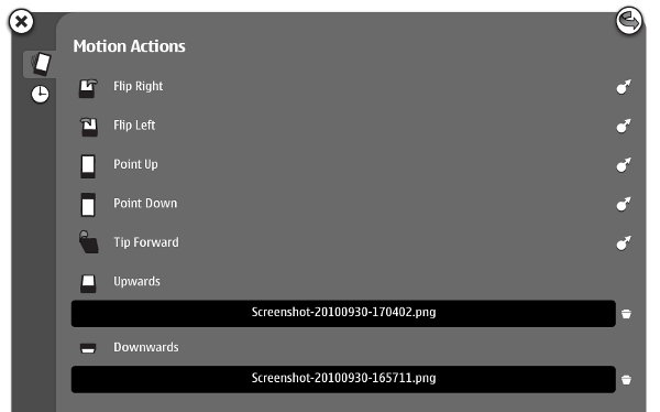
The first new triggers is accelerometer. The prototype can now respond to multiple motions. Just drag the arrow on the right side to the target screen.

The second new trigger. It is great for rudimentary animation and non-interruptible actions (updating, authorizing, etc).
 Beside exporting to WRT and Flash Lite, you can now export to Qt Quick. Qt Quick is the new feature of Qt 4.7 and it allows you to create UI layout and behavior by using a language based on JavaScript. No C++, at least for the not-too-complicated stuff. If you’re familiar with web technologies, you’ll get around very quickly.
Here is the sample of the QML code generated by Flowella for one of the screens. It looks almost the same as the JavaScript object literal.
import Qt 4.7

Item {
   property string jumpToNode: ""
   signal jumpTo
   id: node
   focus: true
   Image {
      source: "Screenshot-20100930-165711.png"
   }
   Timer {
      id: timerTrigger
      interval: 500 /* Note: intervals must be > 0 for the timer to work */
      running: true
      repeat: false
      onTriggered: {
         jumpToNode = "3E579516-E275-5DF8-9AFE-99E9A6FC66B9.qml"
         node.jumpTo()
      }
   }
}
These are some of the posts a stumbled into the other day. I picked them because they gave me a lot of food for thought. I hope they make you think too.

If you’re designing or prototyping an application for Nokia N900, this resource could be very helpful. N900frame_template.zip contains a SVG file with a N900 background (just like in the header photo), a status bar and a 800x480px workspace so you can easily export your work in native screen size and test it in one of available prototyping tools (like Flowella).
 The frame was created in Inkscape, but you can easily import it in some other vector drawing program (AI, CorelDRAW) or use raster graphics in the bundle (N900 hardware and status bar pictures) in Photoshop or GIMP. All the sizes are pixel perfect so you can use it to create quick mock-ups or the final design.
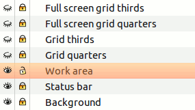
The SVG file contains layers with normal and full-screen grids that are helpful for quick prototyping. Status bar can be easily removed so the full screen canvas awaits you.
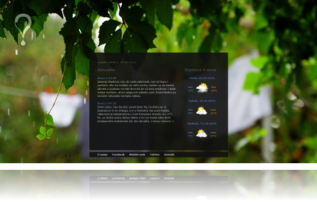 Today is a special day for us. Yes, we’ve redesigned and set the new course of our first company’s project, weather forecast Kad će Kiša. But beside that, there are a few technologies and draconian decisions we’ve used for the first time.
The site is far from over. It needs some front-end improvements and new back-end features, and we’re working on them. But it’s a good feeling to deliver something new and receive some quality feedback.
 In the previous post we have talked about why you should use a version control software for your design work and explained a bit about how they work. Now we’ll use one of them to show how to set up a workflow and avoid common problems.
Whew, finally found some time to write another post. This time we’ll be using Maemo’s alarm framework to do, well, almost whatever we want at a specific time, or even repeatedly at specific times :) So let’s get to it.
Version control, revision control or, in programming terms, source control systems are different names for one thing – a system that manages different versions of your digital work. In this article SCM abbreviation will be used to refer to it. In most cases they are used for source code (text files) management, but there is nothing limiting them from managing other types of files. Documents, spreadsheets, presentations, graphics are all viable candidates.
This article analyzes designer’s needs and shows how he or she can use SCM to help organize its work files. The first part shows why it’s good to use version control systems, explains what types of those systems exist and how they work. In part 2 we’ll use one to set up a few workflows that could be good for design work.