It seems you can’t turn anywhere today without some mobile app hitting you over the head. As it became so common and used everyday, it’s definitely time to continue a well known series and to see how to create one.
Idea
Ideas are many and they can come from different sources. It can be a client’s idea or yours. You can extend your own products or services with a new media (mobile weather forecast) or build it from scratch as a stand alone version (calculator).
How to generate an idea is a theme for another post, but it’s very important to have one. And not just a vague idea – you should have a very specific and strong vision of what it would do and how. Otherwise it’s just playing with your mobile device. It can be fun for you, but not very useful for others.
Mock-ups
This is where the hard work starts. As soon as you have decided on an idea, it’s time to create something. The path to a finished application is very long and hard. It gets worse towards the end so it’s better to make most of the mistakes early on. Design and coding are hard and expensive, sketching is not.
Why mock-ups? Because it’s important to define all use-cases, user interactions, application structure and layout up-front. This way you’ll find out many things you didn’t think of. Some are not intuitive, others overly complex. When you draw ALL the screens and actions, you’ll probably find out it’s more than you predicted, so it also helps time and work organization.

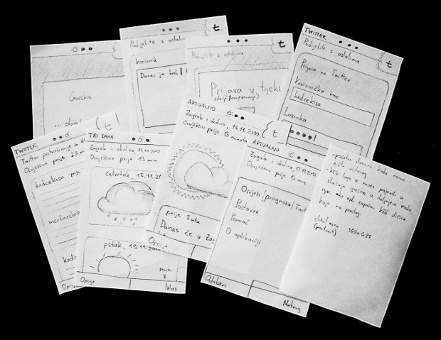
Paper mock-ups are great because they are very quick for small projects; paper cuts can be touched, rotated and easily rearranged, and you can easily write quick notes on the back of it while sitting in the park (no electricity needed :)).
Mock-ups creation is usually accompanied by many brainstorming sessions. If you have a team working on this, it’s good to involve all team members (or at least the leads if it’s too big), especially designers and developers. They are often looking in different directions and the gap can be to big to overcome later. By creating the mock-ups together you can be relatively sure they’re on the same page. Designers will draw all the features needed and won’t try something that’s not humanly possible. Developers will understand why the homepage has to look like that and won’t miss out the fancy window sliding or some transparency effect.
Tools for sketching are many and there isn’t the best one. You’ll probably want to start with something very quick and you can’t beat the pencil and paper or whiteboard. Some later sketching can involve digital tools; classic drawing tools (Photoshop/GIMP, Illustrator/Inkscape) or specialized tools for creating dynamic mock-ups (Balsamiq Mockups, Mockingbird).
Prototype
Involve users early. Is there a better way of doing that than giving them something to play with? Prototypes serve two purposes.
Get feedback from testers and potential users
Mock-ups are great, but you created them and you knew what you wanted to do with the mobile application. Try giving it to a group of random bystanders and see if they understand what that icon in the upper left corner does.
Try some new technical capabilities and discover possible constraints
Not sure if that real-time GPS tracking will work? Try it out as soon as possible to avoid catastrophe further down the road.
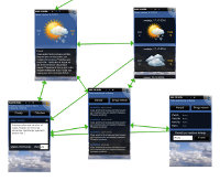
 Developing a prototype can be time-consuming, but there are ways to cheat and get great results. If you need feedback for the user interface, tools like Flowella can be of great help. It frees you of writing code (so even designers can use it) and you can reuse scanned hand drawn or digitally made sketches. That way you can create a prototype really early and test your decisions and assumptions.
Design
Most developers don’t like to admit it (or even say it out loud), but design is the most important thing for the final user. Design is more than just pretty pictures. It’s the intuitive layout and navigation, data presentation and general usability. They all combine to a very popular term used today – user experience. Some of the problems will be solved during sketching and prototyping, so this is the time to finish it and add some polish.
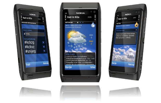
The time of tiny gray forms on business PDAs is long gone. Your application needs to be beautiful to stand out from the crowd and useful to engage users in everyday use.
Resources are many and you will probably conform to the guidelines of the platform you’re developing for. There is one general rule though that will apply everywhere. As some hi-end mobile screens have the resolution almost as a regular screen, but the diagonal is four to six times smaller, be sure to regularly zoom out in your graphic editor and check that text is legible or button big enough to press with a thumb. The most common mistake of the inexperienced mobile designer is to try to put too much small things on the screen at once.

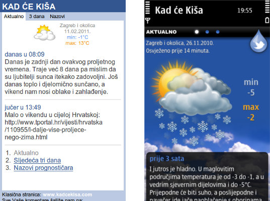
Both the mobile web and mobile application have the same information, but there is no question which one is more enjoyable to use.
Coding
If brainstorming, prototyping new technologies and early testing were done right, most of the problems are conceptually solved by now so coding should be straightforward. That doesn’t mean easy. It is still very complex and hard work, made harder by the fact that the time alloted for it is probably half of what is needed.
Platforms fragmentation and many different devices and vendors can only add to the list of things that can go wrong. Setting up a good development environment can be quite costly in some cases.
Testing
This step is often neglected, but is of vital importance. If you’re a big company, employ testers. If you’re running a small business or are only one person strong, give the mobile application to your friends and family. There is no way you’ve built such a complex product without any errors. It is better that your spouse finds out that the Share button doesn’t work than 10 000 people at once.
Publishing
Now, when it’s all over – know that it’s not. Unless you are distributing the application on your own terms (or building it just for yourself), popular mobile stores are probably the only option to reach millions of potential users. Publishing to application stores requires some technical knowledge (to prepare the installation procedure). It also requires patience because the Quality Assurance process can last from a week to more than a month if they find problems in your application.
When approved, it’s time to congratulate your team and yourself. Building a good mobile application is time-consuming and complicated, but when you see it downloaded and used, you know it was worth it.
