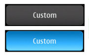
 Standard push buttons on the N900 are functional and look good to boot. But let’s say you need something different for your next “instant-hit” app. Is there a quick and (relatively) painless way of getting that extra shine. Drumm roll, please. Enter the Qt Style Sheets…
So, what’s it all about? Qt Style Sheets are, you probably guessed it, inspired by and closely resemble HTML Cascading Style Sheets. The concept and syntax is very close so if you have any familiarity with CSS you will have no problem whatsoever with QSS.
For this post we will be transforming an “ordinary looking” standard push button on the Maemo platform into a, hopefully, stylish pimped-up version. This will be just a preview of the power behind QSS as the complete coverage would be very, very, very long. :)
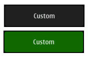
For starters we want to change the colors of our test subject. We are employing a custom look & feel in our app so we want all the visual elements to be in sync. Our favorite colors are black and green so our design will reflect that. This is a snippet of code implementing our makeover:
QPushButton * button = new QPushButton();
button->setStyleSheet(
    "QPushButton {"
        "border: 1px solid #199909;"
        "border-radius: 6px;"
        "background-color: #116a06;"
    "}"
    "QPushButton:pressed {"
        "border: 1px solid #333333;"
        "background-color: #222222;"
    "}");
And this is the result:
As you can see, we are almost in the web CSS land. So far the only difference is the :pressed pseudo-state defining the rules applied when the button is pressed using the mouse or, in our case, finger.
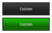
But this is still not it. It lacks something… that’s it… a little gradient to spice things up and make it more 3D like. Normally that would require a custom background image, but QSS has a surprise up its sleeve. Take a look at this:
QPushButton * button = new QPushButton();
button->setStyleSheet(
    "QPushButton {"
        "border: 1px solid #199909;"
        "border-radius: 6px;"
        "background-color: #116a06;"
        "background-color: qlineargradient(x1: 0, y1: 0, x2: 0, y2: 0.67, "
            "stop: 0 #22c70d, stop: 1 #116a06);"
    "}"
    "QPushButton:pressed {"
        "border: 1px solid #333333;"
        "background-color: #222222;"
        "background-color: qlineargradient(x1: 0, y1: 0, x2: 0, y2: 0.67, "
            "stop: 0 #444444, stop: 1 #222222);"
    "}");
And this:
Now this is something we can live with. As I mentioned earlier, this is only a simple preview of the capabilities of QSS. If you want to know more be sure to check out the official documentation as well as stay tuned to our blog for other interesting snippets.


